Ebony Frankland
Описание работы
As I am a surface and textiles pattern designer, I aimed to produce 3 bodies of work that were flexible and suitable for an interiors and fashion application and that addressed both themes assigned to the contest. As I am UK based I began by trend forecasting colours and designs for countries associated with contest, that being Italy and Russia due to the contest being set by Solstudio and the prize being Italian themed.
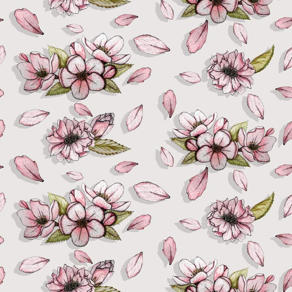
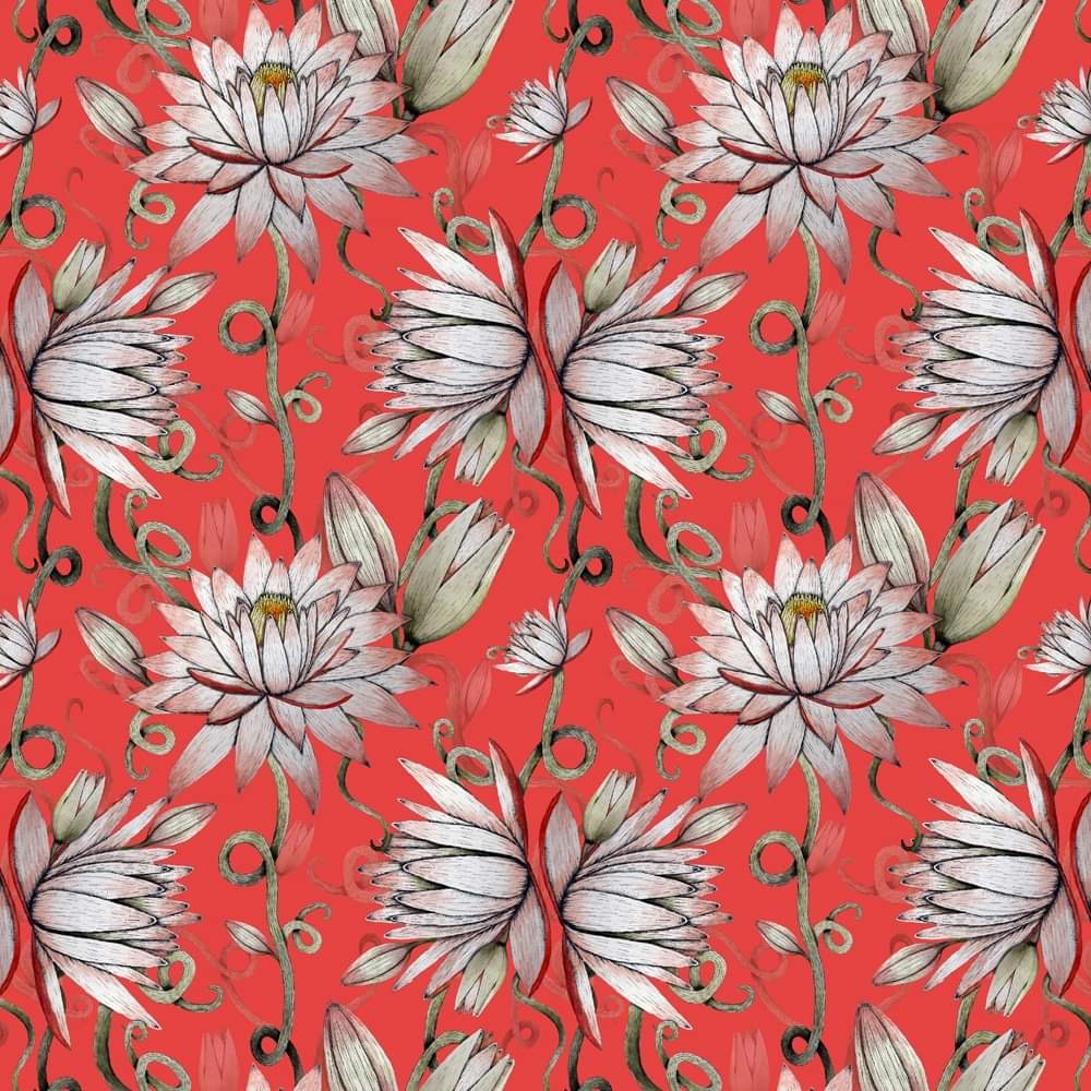
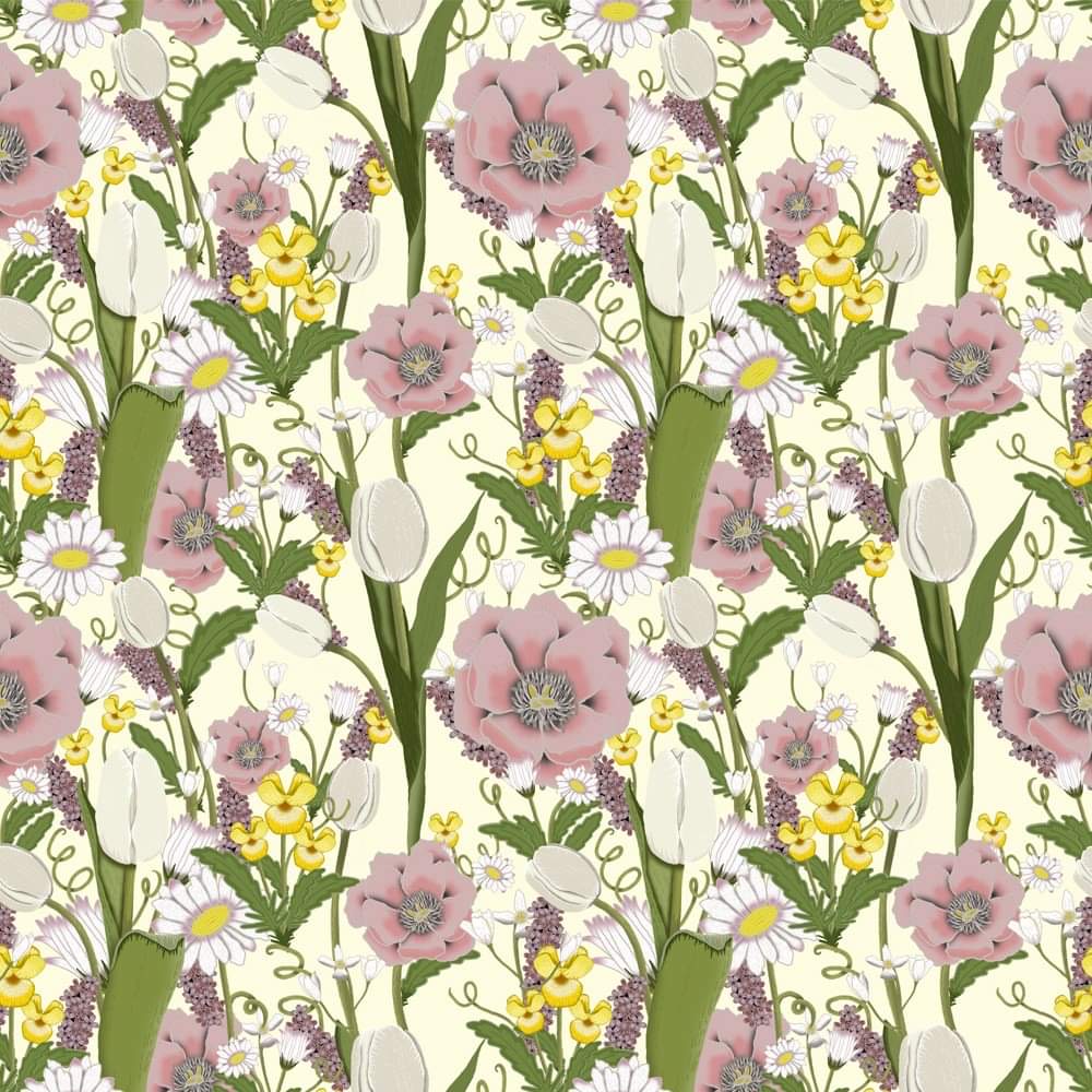
For the first theme “optimism” I researched associations with the word, and researched common aesthetics that matched the theme. I found that there was a strong pattern of spring pastels and floral representation of the theme. I researched into the word “Sakura”, which translates as cherry blossom in Japanese, cherry blossom has a connotation of optimism and new life in japan as it represents the indication of spring. This is how I came to decide my first design of which is a repeat half- drop design of hand drawn and watercolour motifs. I decided on a paired back colour palette as the highlight the cherry blossom. My second design is a lotus, hand drawn with watercolour, also representative of optimism for the country of Malawi, it is the national flower of Malawi and has an emotive response for the country, its representative of hope and peace, this ties in with the cherry blossom’s symbolism to Japan. My final design for the “optimism” theme is almost solely based on the given mood boards, I used retro colours and design layout and used a pastel yellow as the colour yellow is significantly representative of optimism. It’s also a colour associated with spring mood boards colour trends, this design was digitally produced using a Wacom pad, layering motifs to create a busy yet beautiful half-drop repeat.
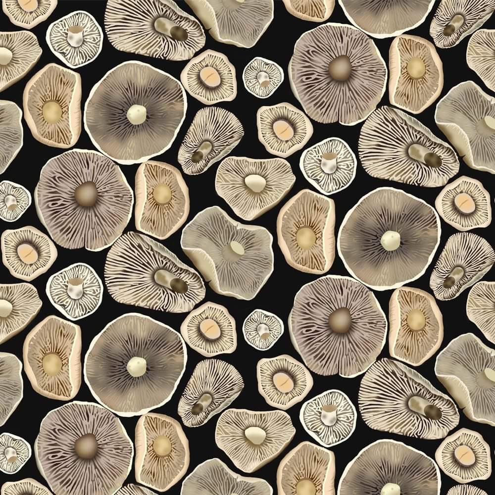
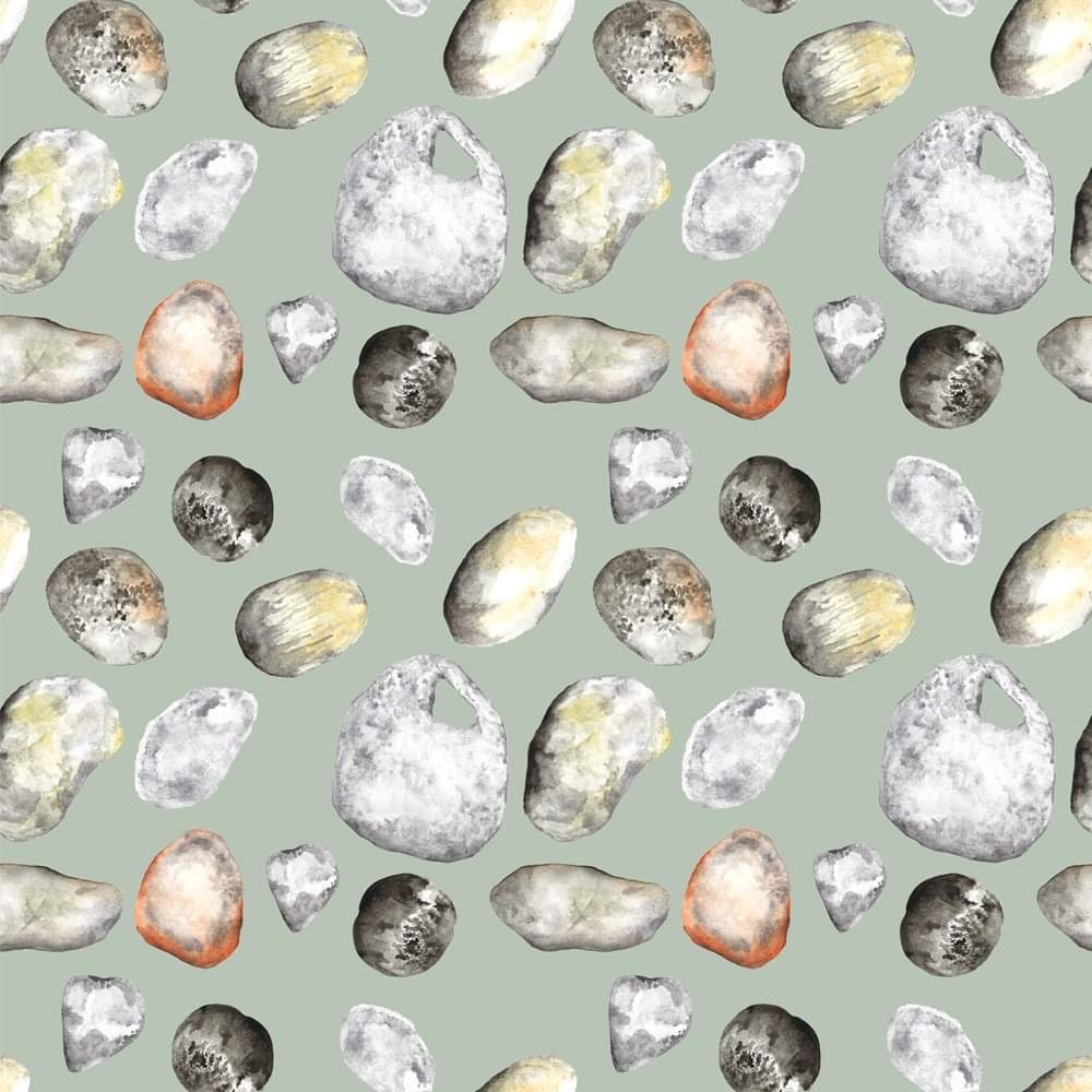
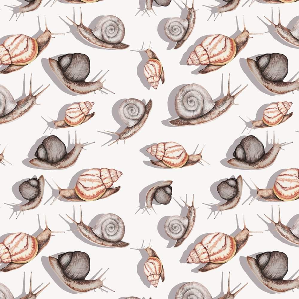
The second theme of “Micro Nature” I tried to produce a theme across the entire design collection of nature, as I found that nature is a constant within all countries symbolism of optimism and micro-nature. The one aim I tried to continue across the 3 designs for the theme was a consistent inclusion of texture. The first design of mushrooms shows the underside of a collection of mushrooms, this was produced using a Wacom pad, I felt that digitally it would create a better overall image. I took this theme as an indication to look at nature almost through a macro lens, which is how I came to the conclusion that all of the designs were to uphold texture as the main focus of the design. The stone design is purely watercolour painting, used in repeat to show the intricacies and colour used within a simple pebble, something that is usually massively overlooked. I found land formations and stones soothing as I find that once again they are a constant in nature within an ever-changing man-made world. And finally, I designed a snail repeat, using watercolour, as I feel they are something that get continuously overlooked and yet they are beautifully textured and something that everyone can instantly recognise. I hoped to produce a repeat design that highlighted the beauty of these creatures as well as showcasing the colours that are involved with their forms.
I enjoyed creating these designs and I thank you for creating such a thought and creativity evoking contest, as it gave me an opportunity to showcase my designs skills having had a difficult year of not being recognised for my art due to the fight for creative roles in the industry. I hope you enjoy viewing them as much as I enjoyed creating them.
 1F9A6F1A-5D95-4590-9246-67281D58E7E7.jpeg
 7903E8C3-44E5-46A5-B227-E9388EC9830F.jpeg
 985502CD-8626-4E59-AAF8-3AEABE7491A2.jpeg
 10066AA4-21F1-4439-9D37-D831FF6AE683.jpeg
 11BDFA1B-F778-4663-BA4C-93F9EB8DC82C.jpeg
 9D2EFC63-23E3-41F5-8823-BE994B4FF055.jpeg